“Everything old is new again”…or so they say. The fact is, when Hollywood runs out of ideas, they have a good time rehashing old ones…or outright stealing them, but that’s another blog post.
All questions of whether some films SHOULD be remade aside, I imagine it can’t be easy to be the designer who is tasked with creating the movie posters for these film remakes. If a movie was a hit in its initial run, or has become a fan/cult favorite, you have to find a way to remain faithful to the original while not alienating the core followers or just outright update it throwing caution to the wind. If the film was a flop, or is so old no one remembers it, then the designer has to wonder how much of the original to leave showing through. And then there are those films, that share similarities and are called remakes…but in the end differ greatly from the originals…

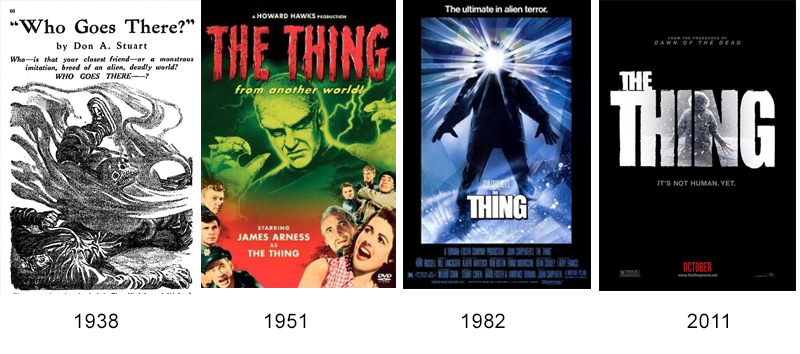
“The Thing” posters through the years
The Thing From Another World (1951) + The Thing (1982) + The Thing (2011)
Originally a pulp story from the 30’s entitled “Who Goes There”, what we now know as “The Thing” has been updated several times. The movie poster for “The Thing (From Another World)” is very 1950’s movie matinee, complete with screaming damsel and the superimposed faces of all the stars (come to see your favorite!), it’s full of sci-fi camp and meant to bring in all those Saturday matinee crowds. John Carpenter’s 1982 “remake”, I use quotes because many feel it was a bit more faithful to the original written story, focuses more on the horror aspect, and at the same time plays to Carpenter’s fans from his “Halloween” film of a few years earlier. The difference between these two is vast, and in the same way shows you that this is decidedly NOT the same film your parents / grandparents may have seen at the drive-in. The 2011 remake (Prequel, they claim!) of Carpenter’s version updates the 1982 theme, while still retaining the horror of its predecessor.

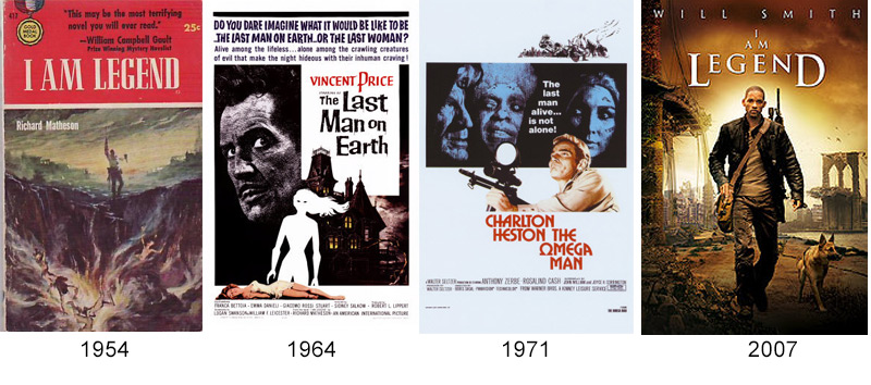
“I Am Legend” posters through the years
I Am Legend (1954) + The Last Man on Earth (1964) + The Omega Man (1971) + I Am Legend (2007)
These posters are a great example of how the design world itself has changed over time. The original cover for Richard Metheson’s “I Am Legend” novel shows the pulp nature it was perceived as, while giving a glimpse of the contents through the “end of the wolrd” cover art. In fact, “I Am Legend” helped to spawn the zombie apocalypse genre that would follow decades later…but I digress. The first version of the film, entitled “The Last Man On Earth” and starring Vincent Price in the lead role, got a perfectly campy gothic treatment in it’s poster, falling somewhere between the 50’s drive in culture and the hippy DIY aesthetic that would come a couple years later.
Charlton Heston’s 1972 remake, entitled “The Omega Man” plants itself firmly in the 70’s, and plays subliminally on the idea of the women’s and civil rights movements by having the hero (a strapping man with a gun), as the only one in color, while the “villains” (two women, one of them African-American, with an androgynous, albeit male, third face) are super-imposed in duotone. The most recent version, starring Will Smith, and going back to the original title, eschews all that the previous posters did, with only slight nods to their existence. Will strolls warily through a desolate landscape (like the first) under a tagline that combines the title of the 2nd, with the tagline of the 3rd.

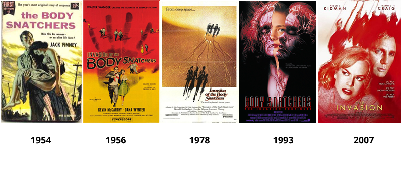
“Invasion of The Body Snatchers” posters through the years
Invasion of The Body Snatchers (1954) + Invasion of The Body Snatchers (1956) + Invasion of The Body Snatchers (1978) + Body Snatchers (1993) + The Invasion (2007)
I know, I know…thats twice in a row I’ve started with a book instead of a movie poster, but I think it helps show the progression. The original “Invasion of The Body Snatchers” played wonderfully on the red scare fears of the Communist weary 1950’s, tapping into a visceral gut reaction from the American movie-going public…hence the remakes. (I could do an entire blog on how successful horror films play against the collective consciousness of the public) Aside from the 1993 remake, each of the movie posters follows a very similar theme… shadowy undefined figures are coming to get YOU! Hey, if it ain’t broke don’t fix it. The ’93 remake is as forgettable as this poster art suggests, and like the art, IMHO was merely a vehicle for great special effects. Even if Roger Ebert DID give it four stars, and one critic called it “One of the creepiest and most overlooked horror movies made in the past decade, featuring a strong, scary turn by Meg Tilly“.

